
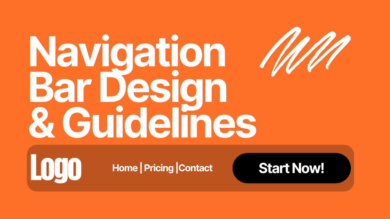
NavBar Design and Guidelines
How do your end-users navigate your website?
While it's difficult to place yourself in their shoes, it's nearly universal that the Navigation Bar is their primary road map of your website.
It tells them where they are and where they can go. Thus, it's super important to get right. And responsive!
At its core, a NavBar has a few elements:
Where you are
Cohesion
Available routes
Where you are:

Example of a well designed NavBar from LinkedIn
While this is typically your header's job, the NavBar should also have this information. Be it by a simple boldening of the current page the user is on or a colour change of that page name.
While the entire page (and website) should be designed in a way that doesn't confuse any user as to their current location via the design, layout, and style, it's still important to have that guidestone to help them understand where they currently are as they could arrive to your website via any URL.
The NavBar does this job tenfold when it's fixed on the screen. More on fixed NavBars will be mentioned later.
Coheason:
It's important to take note of the context elements will be viewed in. This is most important for the NavBar.
While a tempting design choice, it's important to make the NavBar match any pages on the website. Meaning it should match in colour palette with the rest of the page, contain the same or similar branding, etc
As a guideline and tradition, the Logo is typically on the left side and some sort of CTA (a button or checkout cart) is on the right of the NavBar. If this is the layout you've chosen for, say, the home page, then it needs to remain this way throughout the entire website otherwise it's confusing and off-putting
Home-Page-First Design
This refers to the approach of designing the website from the Home Page out. As this is where the majority of users will get their first frame of your website, it needs to be appealing and harmonise together. Ensure it doesn't cover too much of, say, the hero section, doesn't take away from the main story of the page, and isn't too distracting or confusing. To understand this in further detail, visit our page on Hero Sections and what makes them work.
Often large-page count websites have many drop downs, ticker sections, sliders, etc in the NavBar. This simply makes navigation (the primary objective of this element) harder. This isn't the element to sell. This is a map of your website to your end-users (not robots).
Available Routes:
Navigation. This is the primary objective of this element. To allow your end-user to Navigate. It should be ultra-clear what page(s) or section(s) they can visit and where to go if they have something in mind. If an end-user requires information about, say, your pricing. It should be ultra-clear where they need to head for this information. This is called User Acceptance Testing. It is essential to website design and shouldn't be skipped out on.
Fixed NavBars:
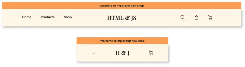
An example of a responsive NavBar
Having a fixed NavBar is a multiplier. Any bad component of its design, layout, or style will be amplified, and vice versa for good components. This simply means more refinement and ensuring a perfect balance between helpfulness and staying out of the way. It's unbelievably easy for a fixed NavBar to get annoying and in the way of elements users would like to either interact with or read
This is where transforming a NavBar into a more transparent & friendly variant may come in, however, it's important to make sure that this isn't being used as a band-aid to a poorly designed NavBar. These two variants should be treated as two completely different elements thus they should be tested, designed, and styled as such.
While these are the main elements of a NavBar and getting them right ensures a proper, useful NavBar, it's valuable to learn by doing and experiment with different ideas you might come up with. Websites aren't one-size-fits-all and should never be treated as such.